A lighting plan can look great on paper but fail spectacularly once the ceiling closes in around it. Not that a 4000K source is somehow ‘neutral’ – that same colour temperature looks fabulous with concrete tiles and brushed steel but is positively cold when paired with timber panelling. Meanwhile, 3000K downlights look stunning on wood but make a plaster worktop look grey and gloomy. Getting the colour temperature right for any given LED project means understanding the context – the room, its contents and purpose, the time of day, and the likely effect on the overall ambience, rather than simply picking a Kelvin value and sticking with it.
What Will People Actually Be Doing Under the Light?
The first useful question is not “Which Kelvin value looks better?” It is “What must people see, and how long will they remain in the space?” A reception area, packing bench, and hotel corridor have different visual jobs.
Does the space need atmosphere, concentration, or inspection?
Warm white light, which is generally between 2700K and 3000K on the color temperature scale, tends to be more flattering to wood, textiles, food, and warm-colored paints. It can be used to create inviting environments conducive to relaxing customers. Warm white light does not make objects appear so defined, which means it is not as effective when it comes to reading small print and noticing fine details.
On the other hand, cool-white light tends to enhance the visibility of labels, light-colored surfaces, and fine print, which means it is easier on the eyes when it comes to working environments. However, this does not mean that cool light with a color temperature of 5000K is the most suitable option for offices and factories because working in such conditions for long hours without breaks can be extremely fatiguing.
Why does illuminance change the way CCT feels?
A low level of “warm” (3000K) illumination may be desirable. If you increase the power level significantly, the same color temperature will look washed out/yellow. A “cool” color temperature is generally desaturated at low power levels, but takes on a bluish tint at high power levels.
This is why you shouldn’t judge by a tabletop sample – the fixture has to be hung at its intended height, and viewed at the power level it’ll be used at, since these are directly related to color appearance, despite being separate specs. The color temperature, distribution pattern, and brightness are all variables that contribute to the visual effect, though they are often specified separately.
How Do Finishes and Daylight Alter the Result?
Light reflects from walls, floors, ceilings, furniture, products, and people. Those surfaces can pull a nominally neutral source warmer, greener, or colder.
Which materials reveal a poor choice quickly?
Timber, leather, food, skin tones, beige fabrics, and red packaging often expose light that is too cool or spectrally weak. White stone, stainless steel, glass, and blue-gray finishes can look muddy under an overly warm source.
Bring actual materials into the mock-up. A retail review should include merchandise; a hotel should include fabrics and finishes; an office should include desks, screens, and printed documents. Paint cards alone rarely tell the whole story.
What happens when daylight changes through the day?
A room with lots of windows can feel balanced at noon and entirely different after sunset. Daylight typically has a cooler color temperature than the lighting indoors, so that a 3000K installation would look yellowish on the facade at daytime hours. At night, it would look just right.
Tunable white can be beneficial in specific cases, but it introduces complexity and points of failure for the facilities management team. It’s best to think about whether different daylight conditions profoundly influence the operation of the space.
Why Can Two Fixtures With the Same Kelvin Rating Look Different?
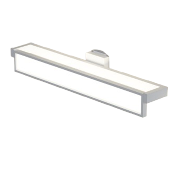
Nominal CCT is only a label. Two products marked 4000K may use different LED packages, phosphors, drivers, optics, or diffusers. One can look slightly green while the other leans pink.
How much variation is acceptable across one project?
It depends how much it’s going to show. Some difference is lost in small utility rooms, but becomes glaring when dozens of items are placed on the same ceiling plane, washed against the same wall, or mounted above the same display.
For these jobs, the buyer needs to specify a chromaticity tolerance and see samples side-by-side. Seeing one fixture next to another is not a good test of visual compatibility, since memory of whites is not reliable from day to day.
Can dimming or heat shift the appearance?
Yes. Some LED and driver combinations hold a stable white point as output changes; others show a visible shift at low dimming levels. Thermal conditions inside the luminaire can also influence output and color.
A sample approved at full power in an air-conditioned room may not match the final installation at 20% output or inside a warm ceiling void. Test the actual driver, control system, and operating range.
Which Color Temperature Fits Each Project Zone?
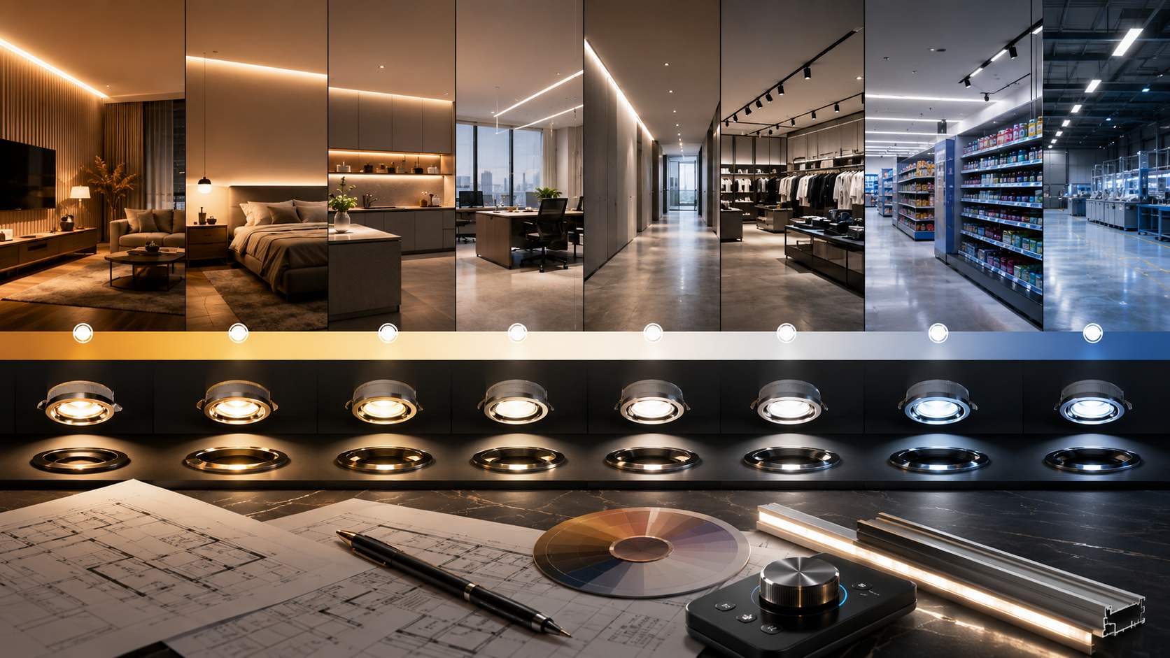
One Kelvin value across an entire building may simplify purchasing, but it can flatten the design. A more useful approach is to divide the project by activity, visual tone, and adjacency.
Where are 2700K, 3000K, and 4000K commonly considered?
Around 2700K to 3000K is ideal for guestrooms, restaurants, lounges, and other customer areas that are themed around warmth. In offices, classrooms, stores, corridors, or other commercial places, around 3500K to 4000K is a decent choice.
Transitions are significant to take into consideration. For instance, one would not choose to create a warm lobby and an icily bright corridor next to it, as they may shock a person walking from one to the other, despite both lighting choices being good in their respective areas. As such, areas connected by glass or doors should be observed as single units.
When is 5000K or cooler worth considering?
Cool white may suit inspection areas, workshops, laboratories, parking structures, and certain warehouses where detail and contrast take priority. It can also feel natural in spaces dominated by strong daytime light.
Still, cooler is not automatically more functional. Harsh optics, reflective surfaces, or late operating hours may turn discomfort into the real performance problem. A night mock-up is often more revealing than a daytime review.
What Should Buyers Lock Before Approving Production?
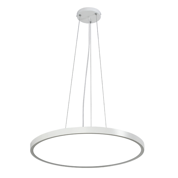
Once the room looks right, the specification has to preserve it. Many disappointing installations begin with an approved sample and end with a production batch using a different LED package, driver, diffuser, or optical component.
Which details belong in the approval file?
Record CCT, chromaticity tolerance, color-rendering requirements, lumen output, beam angle, dimming method, driver model, optics, housing finish, voltage, and environmental conditions. Keep a physical reference fixture when the project is visually sensitive.
Do not rely on descriptions such as “warm white” or “natural white.” Those terms vary between suppliers. Measurable limits give procurement and receiving teams something concrete to compare.
How should production units and replacements be checked?
Random fixtures should be viewed side by side before shipment, preferably at the intended dimming level as well as full output. Labels, drivers, optics, finishes, and batch identification also need verification.
Replacement planning deserves attention before handover. A later fixture with the same wattage and nominal CCT can still look different. Approved component records and a small quantity of original spares can prevent a patchy ceiling years later.
How Can an LED Lighting Supplier Support Color-Temperature Decisions?
Lionway Electronics offers LED lights for commercial, architectural, industrial, and project-specific applications. When submitting a request for a project quote, the information to be provided includes the function of the target room, mounting height, desired level of illumination, color temperature, need for color rendition, beam spread, dimming requirement, voltage, surroundings, and the number of required devices. After that, it will be possible to examine the samples in the target environment to assess the whiteness, glare, beam spread, appearance, driver performance, and control compatibility. Quotations should identify the proposed LED package, driver, optics, housing, finish, packaging, lead time, and inspection items. Before production, buyers should approve physical samples, drawings, tolerances, labeling, batch identification, and written change-notification requirements for receiving inspection and future replacement planning.
Conclusion
The choice of color temperatures for LEDs in the context of specific projects is not a matter of common sense; designating 3000K for cozy areas and 5000K for offices is only an aspect of the larger mechanism. The task, surfaces, daylight, illumination, optics, dimming behavior, and perception time must be considered as interconnected conditions that affect the final outcome. Most importantly, the realization of a large-scale sample is needed to identify the exact appearance and its approval. In the next step, it is essential to define tolerances and specific components that would guarantee the visual quality of the LED product.
FAQs
1. Is 3000K or 4000K Better for Commercial Lighting?
3000K usually creates a warmer atmosphere, while 4000K appears cleaner and more neutral. The suitable choice depends on room function, finishes, daylight, illuminance, and operating hours.
2. Does Higher Color Temperature Mean More Brightness?
No. Kelvin describes the visual tone of white light. Brightness depends on lumen output, optics, mounting height, spacing, beam angle, and the reflectance of surrounding surfaces.
3. Why Do Two 4000K LED Fixtures Look Different?
They may use different LED bins, phosphors, drivers, lenses, or diffusers. Dimming level, operating temperature, wall color, and production variation can also change perceived appearance.
4. Should One Building Use the Same Color Temperature Everywhere?
Not necessarily. Different values can improve comfort and visibility by function, but adjacent zones should be reviewed together so transitions do not feel abrupt or visually inconsistent.
5. What Should Buyers Approve Before Ordering LED Fixtures?
Approve CCT, chromaticity tolerance, color rendering, lumen output, optics, driver, dimming behavior, finish, batch identification, reference samples, packaging, replacement strategy, and change-control requirements.